


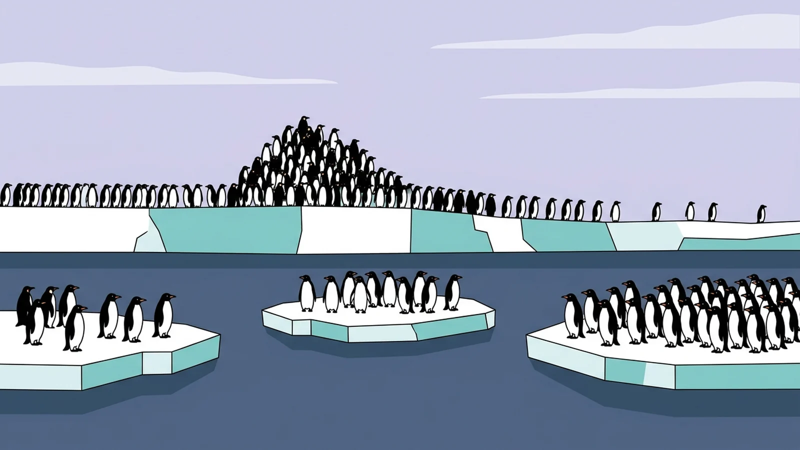
Histogram vs bar graph comes down to one question: what’s on the x-axis? A bar graph compares separate categories, like penguin species. A histogram shows how one set of numbers spreads out, like the body mass of 342 penguins, by counting them into bins along a number line.
Every chart below uses the same real penguins and opens in our maker, so you can change the data and watch the difference.
What’s the difference between a histogram and a bar graph?
A bar graph shows one value for each category, so you can compare the groups at a glance. A histogram takes many measurements of one thing, sorts them into ordered intervals called bins, and shows how many values land in each bin, which statisticians call the distribution. The College Board’s AP Statistics course description draws the same line. Its bar chart shows the categories of a single categorical variable. Its histogram places numeric values “into ordered intervals, or bins, along the horizontal axis.”
That makes the x-axis the fastest histogram vs bar graph test. Category names along the bottom mean a bar graph. Numbers running in order, with each bar covering a range such as 3,500 to 3,750 grams, mean a histogram. The rest follows. You can reorder a bar graph’s bars without changing what it says. A histogram’s bins have to stay in numeric order, and each bar’s width is part of the data.
| Question | Bar graph | Histogram |
|---|---|---|
| What's on the x-axis? | Category names, such as species or products | A number line cut into bins, like 3,500 to 3,750 g |
| What does it answer? | How do these groups compare? | How are these values spread out? |
| What do you start with? | One number per category: a count, total or average | A long list of raw values of one measurement |
| Can you reorder the bars? | Yes, in any order [Unless the categories have a natural order, like ratings from 1 to 5. Keep those in order.] | No, bins follow the number line |
| Gaps between bars? | Usually, to separate the categories | Usually none; an empty bin leaves an honest gap |
| What does bar width mean? | Nothing | The range the bin covers |
| What's on the y-axis? | The value for each category | Count, percent or frequency density per bin |
| Penguin example | Average body mass by species | Body mass of all 342 penguins |
The two look alike enough to fool people who’ve just studied them. A 2012 study at a US university asked students to choose the right chart for a list of numbers, and 10.6% of 341 picked the histogram at the start of the course. Even after an introductory statistics course, only 16.1% of 274 students picked the histogram for a list of numbers. More than 60% chose a chart with one bar per number, shuffled into a bell shape, according to Kaplan and colleagues in the Journal of Statistics Education (2014). More worked examples live on our histogram examples and bar chart examples pages.
Histogram vs bar graph on real data: what does each one show?
The Palmer Penguins data lists 344 penguins from three islands in Antarctica’s Palmer Archipelago, measured from 2007 to 2009 by Kristen Gorman and the Palmer Station Long Term Ecological Research team. It’s free to use under a CC0 license, and body mass is recorded for 342 of the birds. We downloaded the published file and recomputed every number on this page from it.
Ask “which species is heaviest?” and you want a bar graph: one bar per species, one number per bar.
| Label | Average mass (g) |
|---|---|
| Adelie | 3,701 |
| Chinstrap | 3,733 |
| Gentoo | 5,076 |
Gentoos weigh about 1.3 to 1.4 kilograms more than the other two species on average, and Adelies and Chinstraps are almost tied. The chart hides how much penguins vary inside a species. You could also sort its bars by weight or by name, and it would mean the same thing.
Counting birds instead of weighing them still gives a bar graph. The data has 152 Adelies, 124 Gentoos and 68 Chinstraps. A chart of those counts has bars whose heights are frequencies, just like a histogram’s. The x-axis still holds species names, though, so it’s a bar graph of a categorical variable, which is how the AP course description defines one.
Ask “how heavy are these penguins?” and you want a histogram of all 342 masses.
| Label | Penguins |
|---|---|
| 2,500 | 1 |
| 2,750 | 8 |
| 3,000 | 19 |
| 3,250 | 43 |
| 3,500 | 49 |
| 3,750 | 45 |
| 4,000 | 28 |
| 4,250 | 31 |
| 4,500 | 28 |
| 4,750 | 23 |
| 5,000 | 18 |
| 5,250 | 16 |
| 5,500 | 21 |
| 5,750 | 8 |
| 6,000 | 3 |
| 6,250 | 1 |
The tallest bar, 3,500 to 3,750 grams, holds 49 penguins. To its right the bars step down in a long, uneven tail past 6,000 grams, and that tail belongs to the Gentoos: every penguin from 5,000 grams up is a Gentoo. Even the lightest Gentoo, at 3,950 grams, outweighs 106 of the 151 weighed Adelies. That heavy tail pulls the average of all 342 birds to 4,202 grams, two bins right of the peak. Report the average alone and you’d put the typical penguin in a bin with 28 birds instead of the 49 at the peak. The histogram shows both.
Same penguins, two questions: compare the groups, or see the spread.
Is a histogram a bar graph?
A histogram isn’t a bar graph, though it’s drawn with bars and software often files it next to them. Microsoft’s Excel help calls a histogram “a column chart that shows frequency data,” and Excel lists it under Insert > Insert Statistic Chart > Histogram. The documentation for R, the statistics language, takes the other side: “Typical plots with vertical bars are not histograms.”
Both describe the same picture from different ends, which is why the histogram vs bar graph question keeps coming up. A histogram uses bars as a drawing tool; the numeric axis underneath makes it a histogram. Both charts are old. William Playfair printed a bar chart in his Commercial and Political Atlas in 1786. The word histogram reached print in 1895, in a paper by Karl Pearson. He had used it in his statistics lectures and described it as columns whose areas mark the frequency over the range of their base.
Do histogram bars have to touch?
Histogram bars usually touch, but only one of four standard references we checked requires it. The OpenStax Introductory Statistics textbook builds it into the definition: a histogram “consists of contiguous (adjoining) boxes.” The AP Statistics course description, the Common Core grade 6 standard that lists histograms, and NIST’s e-Handbook of Statistical Methods describe histograms without mentioning gaps. Gaps are still the first difference many histogram vs bar graph explainers mention. Software treats spacing as a drawing setting. R draws histogram cells as adjoining intervals but leaves a gap of 0.2 bar widths in its bar plots, and Google Sheets’ histogram chart has a “Show item dividers” option.
A real histogram can have gaps for two reasons. An empty bin leaves a gap because no values fell in that range, and the gap is information: in the 100-gram chart further down, the two bins from 6,100 to 6,300 grams are empty. Some tools also draw thin dividers between bins so the bars are easier to count. Neither turns the chart into a bar graph, because the axis is still a number line. A teacher who marks down a histogram with gaps is right in a class that follows a textbook like OpenStax, where touching bars are part of the definition. Draw them touching on the test.
Can a histogram show discrete data?
Yes. Discrete data are counted values, like books bought or children per family, and a count is still a number on a scale. OpenStax’s own worked example is a histogram of the number of books bought by 50 part-time college students. The AP course description agrees: a quantitative variable takes “numerical values for a measured or counted quantity.” With only a few whole numbers, center each bar on its value: a bin from 0.5 to 1.5 for one book, 1.5 to 2.5 for two, and so on.
Two kinds of numbers belong in other charts. Ratings such as 1 to 5 stars, or “strongly disagree” to “strongly agree,” are ordered categories, often called ordinal data. Their steps are labels in order, and the distance between “agree” and “strongly agree” isn’t a measured amount the way 100 grams is. Count how many answers each level got, draw a bar graph, and keep the levels in their natural order instead of sorting by height. Years and months usually tell a story over time, which a line graph shows better than either chart.
How many bins should a histogram have?
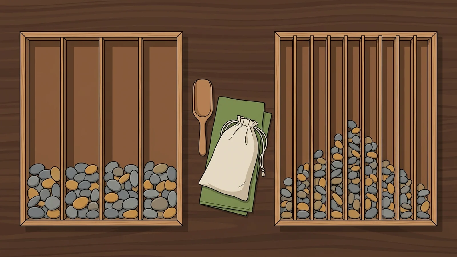
Changing the bin width can change a histogram’s shape, so try two or three widths before trusting it. Start with a rule, then look at the chart and adjust. The AP course description warns that changing the bin widths “can change the appearance of the histogram,” and the penguins show how much. With 1,000-gram bins, 156 of the 342 birds land in a single bar, and the tail of heavy Gentoos shrinks to two blocks.
| Label | Penguins |
|---|---|
| 2,000 | 9 |
| 3,000 | 156 |
| 4,000 | 110 |
| 5,000 | 63 |
| 6,000 | 4 |
With 100-gram bins the chart breaks into 37 jittery bars. Neighboring bars jump up and down by as many as nine penguins, and two empty bins appear at the heavy end.
| Label | Penguins |
|---|---|
| 2,700 | 1 |
| 2,800 | 2 |
| 2,900 | 6 |
| 3,000 | 7 |
| 3,100 | 7 |
| 3,200 | 11 |
| 3,300 | 16 |
| 3,400 | 21 |
| 3,500 | 19 |
| 3,600 | 16 |
| 3,700 | 23 |
| 3,800 | 15 |
| 3,900 | 21 |
| 4,000 | 12 |
| 4,100 | 11 |
| 4,200 | 11 |
| 4,300 | 11 |
| 4,400 | 14 |
| 4,500 | 6 |
| 4,600 | 13 |
| 4,700 | 15 |
| 4,800 | 10 |
| 4,900 | 7 |
| 5,000 | 9 |
| 5,100 | 5 |
| 5,200 | 7 |
| 5,300 | 7 |
| 5,400 | 6 |
| 5,500 | 11 |
| 5,600 | 5 |
| 5,700 | 6 |
| 5,800 | 5 |
| 5,900 | 2 |
| 6,000 | 3 |
| 6,100 | 0 |
| 6,200 | 0 |
| 6,300 | 1 |
Three classic rules give you a starting point. Sturges’ rule (1926) picks about log2(n) + 1 bins, where n is the number of values and log2(n) is how many times you can halve n before reaching 1. For 342 penguins that’s 10 bins. Divide the range, 2,700 to 6,300 grams, by 10 and each bin is 360 grams wide. Sturges is R’s default and the rule our histogram maker starts from, and at 360 grams the same peak and tail appear. Click Open in the maker under any histogram here and it loads all 342 masses, then bins them itself, starting from these 10 bins. Scott’s rule (1979), which Excel uses for its automatic bins, sets the width from the standard deviation (how far values typically sit from the average). Here it gives about 400 grams. The Freedman-Diaconis rule (1981) uses the interquartile range instead, the spread of the middle half of the data, and gives about 343 grams. When the rules disagree, draw two of them and keep the one that shows the shape without noise. We used 250 grams in the histogram above so the axis reads in round numbers.
In Excel, right-click the horizontal axis, choose Format Axis and set Bin width or Number of bins. In Google Sheets, pick the Histogram chart and change the bucket size, Google’s name for bin width, under Customize > Histogram; our Google Sheets guide walks through the rest. Check which edge each bin includes, too. Five penguins weigh exactly 3,750 grams. With 250-gram bins, R’s default counts a value on an edge in the bin below, so they land in the 3,500 to 3,750 bin. Our charts above count it in the bin above, so the same five land in the 3,750 to 4,000 bin. Either rule works if you use it consistently and say which.
What if the bins aren’t the same width?
When histogram bins have different widths, each bar’s area, not its height, has to show the count. Karl Pearson defined the histogram that way in 1895. R’s documentation still draws unequal bins so that each rectangle’s area is the share of data points inside it, the same idea on a 0-to-1 scale. The height becomes frequency density: the count divided by the bin width, in any unit of width you like, as long as every bar uses the same one.
With the penguins, merge the four lightest 250-gram bins into one bin from 2,500 to 3,500 grams, and it holds 71 birds. Drawn by count, that bar would tower over the 49 penguins at 3,500 to 3,750 grams, though it covers four times the range. Divided by width, the wide bin has 7.1 penguins per 100 grams and the peak bin has 19.6, so the peak stays the peak.
When should you use a histogram vs bar graph?
Use a bar graph to compare groups and a histogram to see how one measurement spreads. Four questions settle almost every case:
- What goes on the x-axis? Names, groups or rating levels mean a bar graph. A measurement split into ranges means a histogram.
- What do you have? One number per group, like a total or an average, makes a bar graph. A long list of measurements makes a histogram; a long list of ratings is still counted per level and drawn as a bar graph.
- Do the distances between values mean something? If 4,000 grams is exactly 250 grams more than 3,750, you have a number line and a histogram. If the values are names or levels, it’s a bar graph.
- How many values? Up to a few dozen fit a dot plot, where every value stays visible. Hundreds read best as a histogram.
Five histogram vs bar graph mistakes to avoid:
- Sorting a histogram’s bins by height, which scrambles the number line. If your tool can sort bars, leave sorting off for bins.
- Drawing one bar per raw value when you want the spread. With 342 penguins that’s 342 bars and no shape, the kind of chart most students in the Kaplan study picked instead of the histogram. One bar per player to compare players by name is a fine bar graph; it just can’t show how the scores spread.
- Reporting only an average. A bar graph of averages hides the spread a histogram shows.
- Leaving the y-axis unlabeled. Say whether it shows a count, a percent or a density.
- Starting a bar graph’s axis above zero. Correll and colleagues found in 2020 that bar charts whose y-axes don’t begin at zero make differences look bigger.
Have one number per group? Type your own rows below and the bar graph redraws. For a long list of raw numbers, paste it into the histogram maker, which picks the bins for you, or open the bar graph maker for the full editor.
Try it with your data
What if neither chart fits?
Pick a dot plot for small samples, a line graph for change over time and a box plot to compare spreads side by side. These are the look-alikes people mix up with the two charts above:
| Chart | What it is | Use it when |
|---|---|---|
| Column chart | A bar graph with vertical bars | Category names are short and there are only a few of them |
| Dot plot | One dot per value, stacked over a number line | You have a few dozen values and want each one visible |
| Frequency polygon | One point per bin at its frequency, joined by straight lines | You want to overlay two distributions to compare them |
| Pareto chart | Category bars sorted from largest to smallest, plus a running-total line [Excel's help calls it a sorted histogram, but its bars are categories, such as causes of defects.] | You want to show which few causes account for most of a total |
| Box plot | A box around the middle half of the values, with the median marked | You're comparing the spread of several groups side by side |
| Line graph | Points over time joined by a line | The x-axis is dates, months or years |
For the first two, our column chart maker and dot plot maker take the same pasted data as the makers above.
Comments