



To make a graph in Google Sheets, select your data, including the header row, then open the Insert menu and choose Chart. Sheets draws a chart and opens the Chart editor on the right. Pick a different type under Setup, then style it under Customize.
That takes a minute. The rest of this guide fixes the chart when it comes out wrong, which happens often.
How do you make a graph in Google Sheets?
Select the cells, choose Insert > Chart, pick the chart type under Setup, and adjust the look under Customize. The same four steps make every chart type in Google Sheets, a column chart and a scatter plot alike. Each step has a detail that saves you a fix later.
- Select your data with its headers. Click the top-left cell, including the header row, and drag to the last value. The headers become the legend and the axis labels. Skip them and the legend reads “Series 1” and “Series 2.”
- Open Insert > Chart. Sheets drops a chart onto the sheet and picks a type it thinks fits your data.
- Pick the right type under Setup. In the Chart editor, open the Setup tab and choose from the Chart type list. The chart redraws as you click, so you can try several.
- Style it under Customize. The Customize tab holds Chart style, Chart & axis titles, Series, Legend, the axes and Gridlines. Give the chart a title that says what it shows. To print each value on its bar or point, open Series and check Data labels.
Closed the editor by accident? Double-click the chart to bring it back. To move the chart, drag it. To resize it, drag the blue markers on its edges.
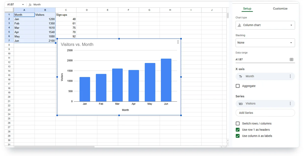
We built this one from six months of visitor counts at an online shop. Hover any column to read its value.
| Label | Visitors |
|---|---|
| Jan | 1,200 |
| Feb | 1,350 |
| Mar | 1,610 |
| Apr | 1,540 |
| May | 1,880 |
| Jun | 2,100 |
How should your data be laid out before you insert a chart?
Put labels in the first column, numbers in the columns next to it, and one header row on top. That’s the shape Google Sheets expects for most charts, and it’s why the same data can look perfect in one chart type and broken in another.
Each chart type reads the columns a little differently:
| Chart | First column | Other columns | Watch out for |
|---|---|---|---|
| Column or bar | Category labels | One column per series | Stacked versions need at least 2 series |
| Line | Time labels (months, years) | One column per line | Keep the time labels in order |
| Pie | Slice labels | One column of positive numbers | Zero and negative values don't show |
| Scatter (XY) | X values | One column of Y values per series | Both columns must be numbers |
| Histogram | Raw numbers, one per row | Optional: more sets of numbers | Sheets counts values into ranges for you |
A data range is the set of cells the chart reads. A series is one column of numbers, drawn as one line or one color of bars. If Sheets draws your rows as series when you meant your columns, open Setup and click Switch rows / columns. If the header row shows up as a data point, check “Use row 1 as headers” in the same panel. If your label column turns into a series of its own, check “Use column A as labels.”
Which chart type should you pick?
Choose by the question your data answers: a column or bar chart compares categories, a line chart shows change over time, a pie chart shows parts of one whole, and a scatter chart shows how two numbers move together. Google’s help lists 17 chart families in all, but the five below cover most everyday charts.
Bar or column graph
Google Sheets calls vertical bars a column chart and horizontal bars a bar chart. Use columns for a handful of categories with short names, and bars when the names are long, like countries or product titles, because horizontal labels have room to run. For a quick version with live editing, try our bar graph maker.
Line graph
A line chart suits values measured over time, like monthly sales or yearly temperatures. Put the dates in the first column, oldest at the top, and each line in its own column. If a month has no value, don’t type 0, because a zero tells the reader the number fell to nothing. Our line graph maker builds the same chart from pasted rows.
Pie chart
A pie chart needs one column of labels and one column of positive numbers. Keep it to a few slices, because people compare angles less precisely than lengths. To show percentages on the slices, open Customize > Pie chart and change the Slice label. If you need more than six or so slices, a bar chart reads better. For a quick pie or donut from pasted rows, use our pie chart maker.
Scatter plot (XY graph)
A scatter chart plots pairs of numbers, so it answers questions like “do higher prices mean fewer sales?” Put the X values in the first column and the Y values next to them. Each extra column of Y values becomes another series in a new color. To add a line of best fit, open Customize > Series and check Trendline. You can also build one in the scatter plot maker.
Histogram
A histogram shows how values spread out, like test scores across a class. Put the raw scores in one column with a header, select that column only, and pick Histogram under Setup > Chart type. Sheets counts the scores into ranges, called buckets, and draws one bar per bucket. To change how wide each bucket is, open Customize > Histogram and set the bucket size.
How do you graph two or three sets of data?
Put each set of numbers in its own column next to the shared labels, select all of them, and insert the chart; every extra column becomes another series. Three columns of numbers give you three lines or three colors of bars.
When the sets use very different scales, the smaller one flattens against the bottom of the chart. Add a column of sign-ups beside the visitors above and you’ll see it: 48 sign-ups barely leave the axis next to 1,200 visitors. Move the small series to a second axis:
- Double-click the chart and open Customize > Series.
- In the dropdown at the top of Series, which starts as “Apply to all series,” choose the series with the small numbers.
- Under Axis, choose Right axis.
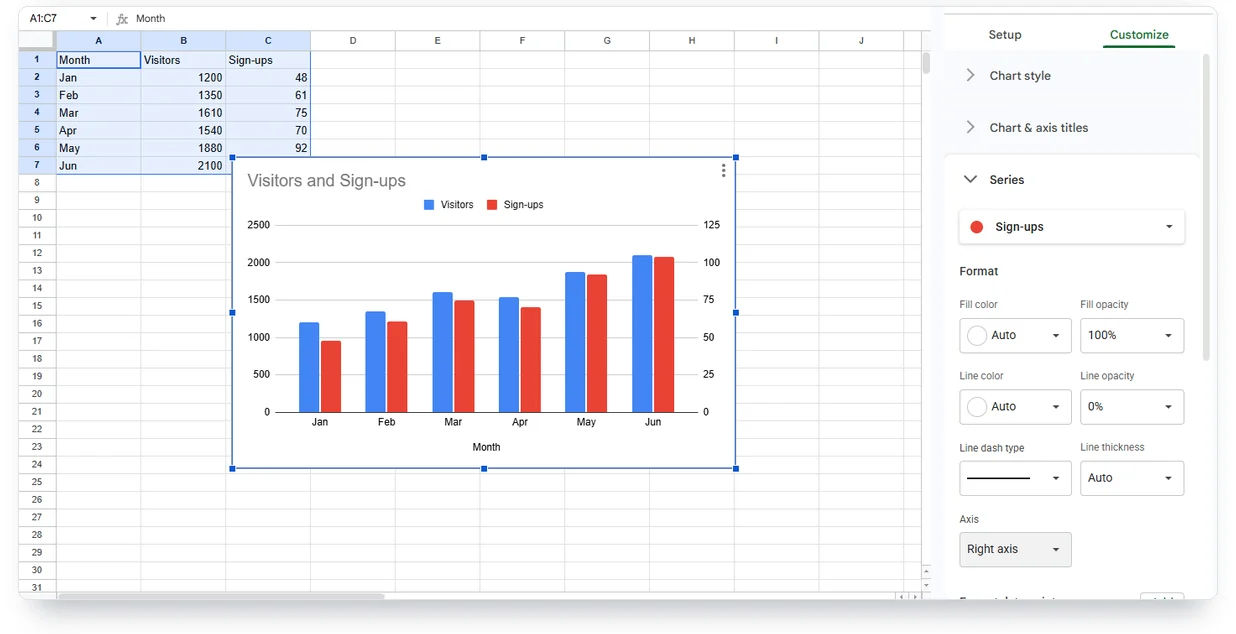
Look at what the second axis does to the picture: 104 sign-ups now stand almost as tall as 2,100 visitors.
Google Sheets offers the second Y axis on line, area and column charts. You can’t add a second X axis. A combo chart does the same job with columns and a line. Pick Custom Combo under Setup > Chart type, then set each series to columns or a line under Customize > Series.
Why does my Google Sheets chart look wrong?
When you make a graph in Google Sheets and it comes out wrong, the cause is usually the data, not the chart. Look for numbers stored as text, a header read as a value, empty rows inside the range, or a series left outside it. Find your symptom below.

| What you see | Why it happens | How to fix it |
|---|---|---|
| Scatter points sit at equal gaps whatever their values, and a "T" text icon shows next to the X-axis in Setup | The numbers are stored as text (an apostrophe, a space or a unit word in the cell); text numbers also hug the left edge of the cell | Check with =ISNUMBER(E2). If it says FALSE, remove the extra characters, or convert the column with =VALUE(E2) in a spare column |
| The legend says "Series 1" and "Series 2" | You didn't select the header row, or Sheets doesn't use it as headers | Select the header row, or check "Use row 1 as headers" under Setup |
| The first bar is a header word with no value | Sheets reads the header as data | Check "Use row 1 as headers," or Switch rows / columns if your headers run down a column |
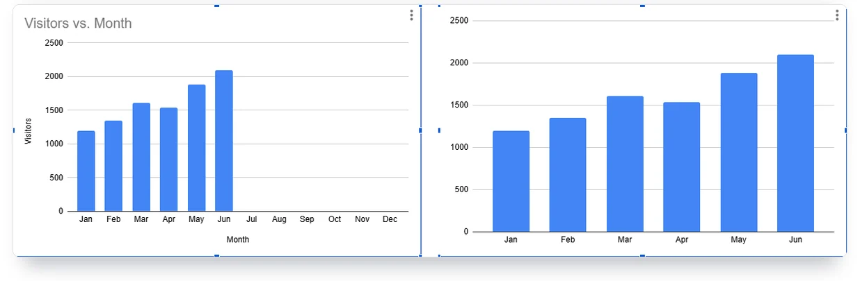
| The chart has a long empty stretch on the right | The label column runs ahead of the data, like dates filled in for the whole month | Chart a helper range instead: =FILTER(A1:B, B1:B<>"") keeps the header and only the rows that have a value |
| A pie slice is missing | Its value is zero or negative | Pie charts draw only positive numbers; use a bar chart for mixed values |
| A second series doesn't appear | Its column sits outside the data range | Under Setup > Data range, widen the range or click Add another range |
| There's no Trendline option | The chart type doesn't support one | Trendlines work on bar, line, column and scatter charts |
| The chart in Docs or Slides shows old numbers | Linked charts don't refresh themselves | Click Update on the chart, or Tools > Linked objects > Update all |
We tested the first row on a real sheet. With the prices stored as text, Sheets spaced 10, 12, 15, 18 and 20 evenly, as if they were names. Typed as numbers, 15 moved to its true place between 14 and 16.
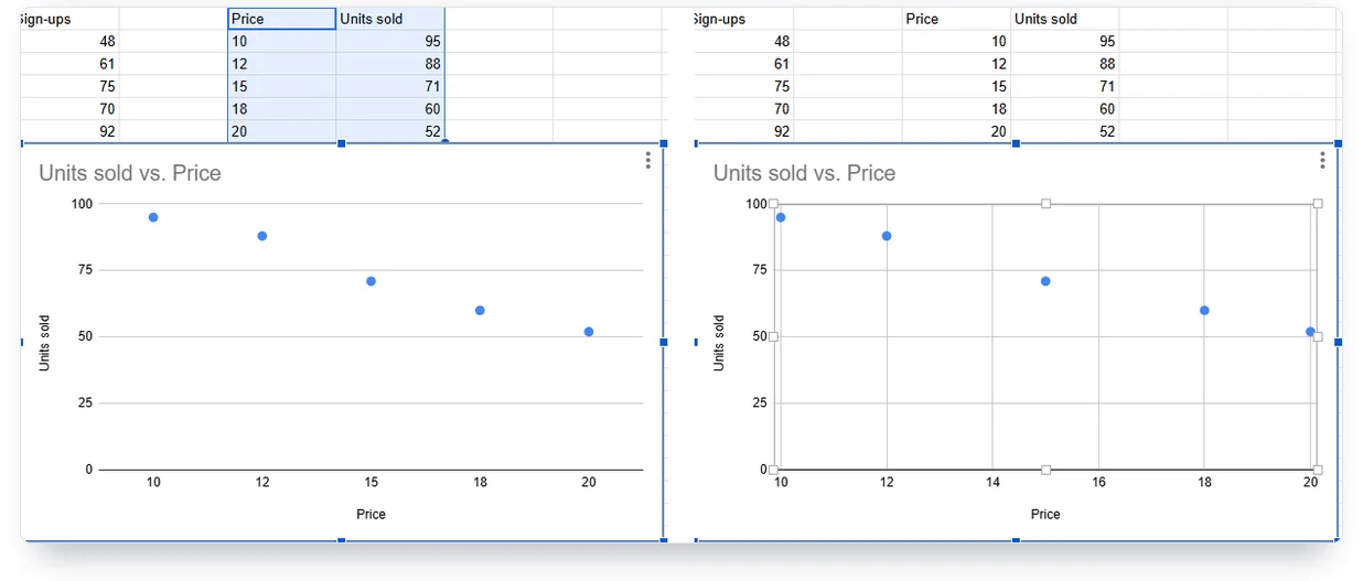
Most broken charts come from the data, not the chart.
The FILTER helper also suits a sheet that grows every day. Type the formula into an empty cell, say D1, and it fills two columns with the header and every row that has a value. Then double-click the chart, open Setup > Data range, and select the helper columns with room to spare, like D1:E500. New rows appear in the chart as soon as you fill them in. If the formula shows #ERROR!, your spreadsheet’s locale probably separates arguments with semicolons: =FILTER(A1:B; B1:B<>"").
Can you make a graph in Google Sheets on your phone?
Yes. In the Google Sheets app on Android, iPhone or iPad, select the cells, tap Insert, then Chart. Double-tap the chart and tap Edit chart to change its type, legend, titles or colors, then tap Done.
The Google Sheets phone app can make a chart, but trendlines, data labels and publishing need a computer. Google’s help pages list the split:
| Task | In the phone app |
|---|---|
| Insert a chart | Yes |
| Change the chart type | Yes |
| Move the legend, edit titles, change colors | Yes |
| Move and resize the chart | Yes |
| Data labels (the numbers on bars) and notes | Computer only [Google's help for Android and iPhone & iPad says to open the spreadsheet on a computer.] |
| Trendlines | Computer only |
| Axis settings, including a second axis | Computer only |
| Download or publish the chart | Computer only |
Need one of those on the phone? Make the basic chart in the app and finish it later on a computer. Or paste the same cells into a browser chart maker, which runs in a phone browser too.
How do you get the chart out of Sheets?
Click the chart, open the three-dot menu at its top right, and choose Download chart (PNG, PDF or SVG), Copy chart, or Publish chart. Pick by where the chart is going.
- For a slide or a report, choose Download chart, then PNG for slides or SVG when you need it sharp at any size.
- For Google Docs or Slides, open the doc and choose Insert > Chart > From Sheets, pick the spreadsheet and the chart, and click Import. The chart stays linked. When the sheet changes, click Update on the chart, or Tools > Linked objects > Update all.
- For a website, choose Publish chart, then Link or Embed, then Publish. Sheets republishes changes automatically, and Google says the update might take a few minutes.

Charts also need a text alternative for screen readers. Alt text sits in the same three-dot menu. Without it, Sheets uses the chart title, so a clear title does double duty.
Can AI make the chart for you?
Gemini in Google Sheets can build a chart from a prompt like “Create a chart with date on the x-axis and total on the y-axis,” but only on an eligible Google Workspace or Google AI plan. Open it with Ask Gemini at the top right of the sheet.
Know what you get. Since June 2025, the inserted chart is editable. But Google’s help says it lands on a new tab with a copy of its data, and it ignores changes in the original cells. For a chart that follows your live data, build it yourself with Insert > Chart.
A faster way when the chart leaves the spreadsheet
Some charts have to look finished: on a web page, in a client report, in your brand colors. When you make a graph in Google Sheets for one of those, you can skip the Sheets styling and paste the same cells into a browser chart maker. In our free chart maker it takes four steps:
- In Google Sheets, select your cells with the header row and copy them.
- Paste them into the maker. The header row becomes the series names, so two columns of numbers arrive as two named series. Fill in or leave out any row with an empty value first.
- Switch between column, bar, line, area, donut and more than ten other types. The chart morphs between shapes and keeps your numbers.
- Download a PNG or SVG, or copy the embed code. An embedded chart stays sharp, interactive and animated on the page. It holds the numbers you pasted and doesn’t follow your sheet, so to update it, paste the new rows and replace the snippet.
The maker needs no account, and the maker processes your data in your browser. Free exports carry a small meikucharts.com mark and embeds show a “Made with Meiku Charts” credit; Pro removes both for $19 a month. Try it with the same visitors data from above, or paste your own:
Try it with your data
| Label | Value |
|---|---|
| Jan | 1,200 |
| Feb | 1,350 |
| Mar | 1,610 |
| Apr | 1,540 |
| May | 1,880 |
| Jun | 2,100 |
If you want the chart to move when the numbers change, read our guide on how to make an animated chart. And if you’re embedding on a site, the embed guide covers the snippet.
Comments